Feedback: Buttons in alerts on Big Sur/Monterey

So since Big Sur, alerts and sheets are displayed in a more iOS-looking fashion.
We just wanted to check out your personal preferences on a particular dialog.
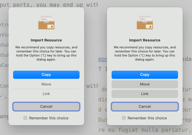
With dialog windows that have more than 2 buttons, it usually looks like the left side of the screenshot. With a "hacky" tweak, buttons can look like the ones on the right:
Author at Zettelkasten.de • https://christiantietze.de/
Screenshot Poll
- Which button look do you prefer?10 votes
- Left: Default look with transparent buttons20.00%
- Right: Tweaked look with backgrounds80.00%
Howdy, Stranger!
Categories
- 3K All Categories
- 153 Research & Reading
- 706 The Zettelkasten Method
- 12 Knowledge Work
- 102 Writing
- 474 Software & Gadgets
- 159 Workflows
- 733 The Archive
- 15 Plug-In Showcase
- 88 Resolved Issues
- 225 Projects Logs and Journals
- 86 Project: Zettelkasten.de
- 53 Critique my Zettel
- 179 Random
- 375 Introduce Yourselves!
Comments
Ok so the tweaked look it is, thanks everyone
Author at Zettelkasten.de • https://christiantietze.de/
... and now it's shipped in the app since v1.7.7 on the Cutting Edge update channel 👍
Author at Zettelkasten.de • https://christiantietze.de/