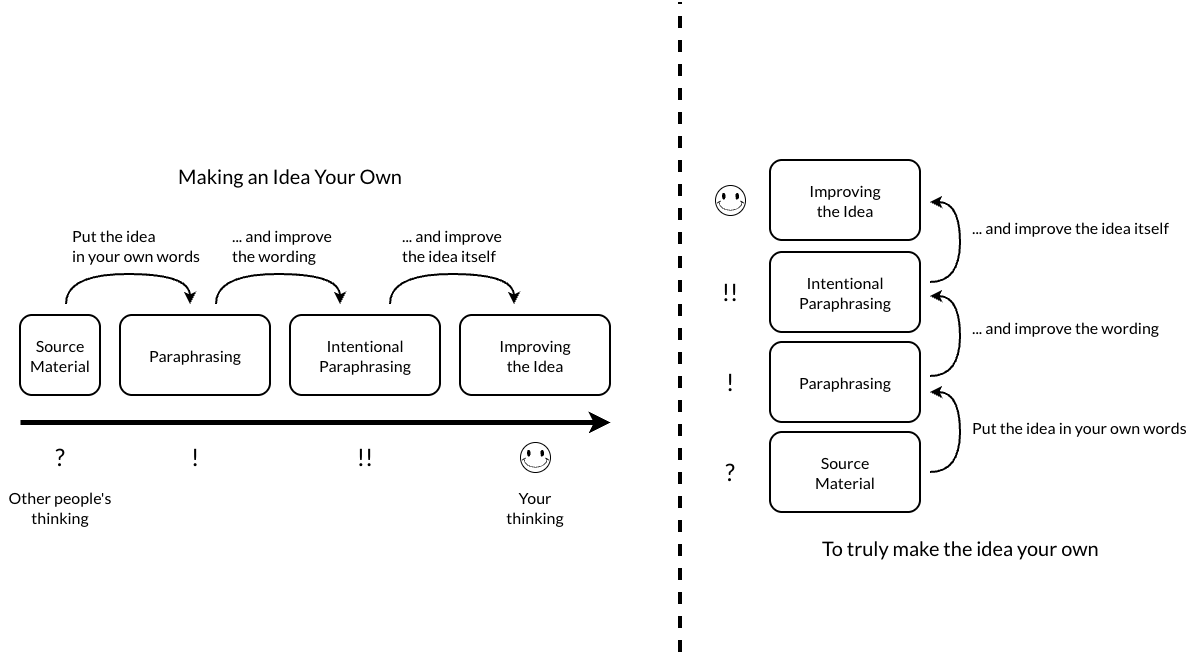
Left hand side (horizontal layout) has cleaner flow; I like the left bottom rather than left top image, as I find the icons in the left top image a bit distracting.
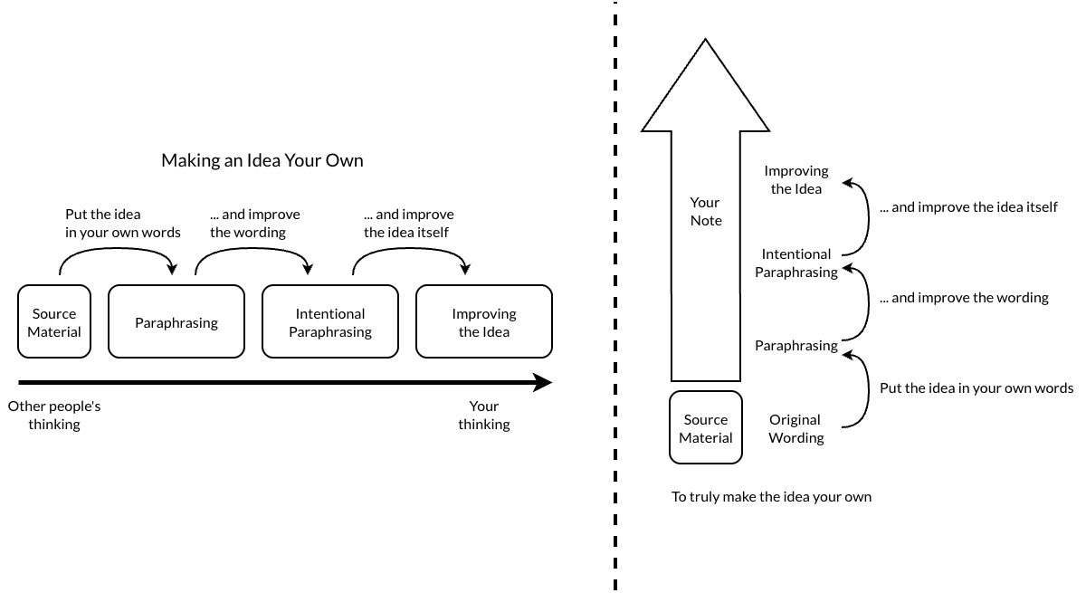
Bottom left is easiest to comprehend at the first sight. Also, I like how the arrow of the bottom right version makes clear what really makes the note (however obvious it may be).
If I were to just pick one, I'd vote for the bottom left.
All contain essentially the same information. In terms of ease of reading, the horizontal layout flows better. The vertical layout opposes the flow and might emphasize the points appearing toward the top more than it intends to. If the diagram is of "Maslow's hierarchy of needs" kind, you might actually want this effect. But I don't think this applies here. The (smiley/exclamation) symbols just seem extraneous here.
Oh, late -- I don't like the huge arrow in bottom-right, but agree with @jwa that the grouping of steps 2,3,4 is unique there. Bottom-left is my favorite otherwise, maybe with a box around the steps "in the note"

Comments
Second looks cleaner.
Left hand side (horizontal layout) has cleaner flow; I like the left bottom rather than left top image, as I find the icons in the left top image a bit distracting.
Bottom left is easiest to comprehend at the first sight. Also, I like how the arrow of the bottom right version makes clear what really makes the note (however obvious it may be).
If I were to just pick one, I'd vote for the bottom left.
All contain essentially the same information. In terms of ease of reading, the horizontal layout flows better. The vertical layout opposes the flow and might emphasize the points appearing toward the top more than it intends to. If the diagram is of "Maslow's hierarchy of needs" kind, you might actually want this effect. But I don't think this applies here. The (smiley/exclamation) symbols just seem extraneous here.
Thanks for your feedback. My first instinct is confirmed: Bottom-left.
Just wanted to properly distrust myself first.")
I am a Zettler
Oh, late -- I don't like the huge arrow in bottom-right, but agree with @jwa that the grouping of steps 2,3,4 is unique there. Bottom-left is my favorite otherwise, maybe with a box around the steps "in the note"
Author at Zettelkasten.de • https://christiantietze.de/