Not shown titles and spaces

Hi there,
I am new to the Zettelkasten and experiencing some issues with spaces and missing titles (see screenshot below). I bought and reinstalled the Archive last week.
- I miss the titles here. The Zettels where the titles are shown were written with an older and unregistered The Archive-Version.
Is there an option to remove this space?
I am using Mojave 10.14.4 on an MBA13 (yes - i dont want to upgrade because Big Sur + suck on older Macs).
Thanks in advance.
Howdy, Stranger!
Comments
@andreas_n, welcome. I hope I can help a little.
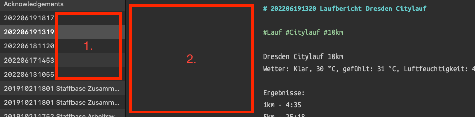
First, the name listed in the "File List" is not directly tied to the first line within that file. They can be different, and one could be missing, as I think is happening in your case. To confirm, look in the directory with Finder and see if there is a file named
202206191319.md or txt. If so, this is the culprit. To add the title to the file while in The Archive, right-click and select Rename.Second, the #2 gap is a function of the monitor size and a few settings in the preferences.
In the setting below (mine), the text will flow across a max of a 90-character line length. If my monitor is broader than this, the 90 characters will be centered in the editor window, and there could be a large space in the area you point to. To confirm this, there should be equal space on the right side of the text.
Making the "File List" window wider will help if it is the problem.
I'm not sure if I've helped or not. Let me know.
Will Simpson
My peak cognition is behind me. One day soon, I will read my last book, write my last note, eat my last meal, and kiss my sweetie for the last time.
My Internet Home — My Now Page
Thanks for the warm welcome @Will - you helped a lot.
The renaming actually worked. Maybe a kind of option like "keep first line and filename in sync" would help. But I dont know if this bothers other users.
The horizontal inset-option and your explanation how the alignment of the editor-text is handled helped, so I will make the windows fit better for me. I would also like a kind of "alignment option" (left, centered, right) for editor-text here.
@andreas_n I just notice you're the first one asking for the limited line width to be disabled altogether!") In the meantime, use a super large "line width". 200 is the maximum there.
In the meantime, use a super large "line width". 200 is the maximum there.
To keep the file name and title/first line in sync is on my to-do list 👍
Author at Zettelkasten.de • https://christiantietze.de/
@ctietze, I hope you're planning on title/first line "after YAML Frontmatter" syncing. Of course, this makes this more complex because the syncing routine would have first to determine if there was frontmatter present or not.
Will Simpson
My peak cognition is behind me. One day soon, I will read my last book, write my last note, eat my last meal, and kiss my sweetie for the last time.
My Internet Home — My Now Page
Aaaaah the line width 200 did what I really wanted :-)
Nice.
When we ship this, as far as it's planned, it'll be "opinionated" and at least in the first iteration likely either is going to be oblivious to front-matter completely and look for the first level-1-heading, or knows about front-matter and then offers a choice to not ignore it")
It's pretty far down the feature list, though; scripting and making the editor more robust still comes next.
Author at Zettelkasten.de • https://christiantietze.de/
@Will Unrelated to this thread, but I always feel as though your screenshots of The Archive have a different look to them to what I see on my computer. I can't quite explain what it is I am seeing. Maybe a more defined and sharper image of the preference pain?
I am running the latest version of The Archive under the latest version of MacOS. Is it something to do with what you use to create screenshots?
@DavidWJ, I use the macOS ⇧⌘5 screenshot utility. A setting in the "Accessibility" preference pane sets the contrast of the monitor. It is designed to help us who are losing our eyesight. These are the settings I use.
Will Simpson
My peak cognition is behind me. One day soon, I will read my last book, write my last note, eat my last meal, and kiss my sweetie for the last time.
My Internet Home — My Now Page
Thank you for this. I wonder sometimes how many settings there are that I am unaware of, hidden away somewhere!