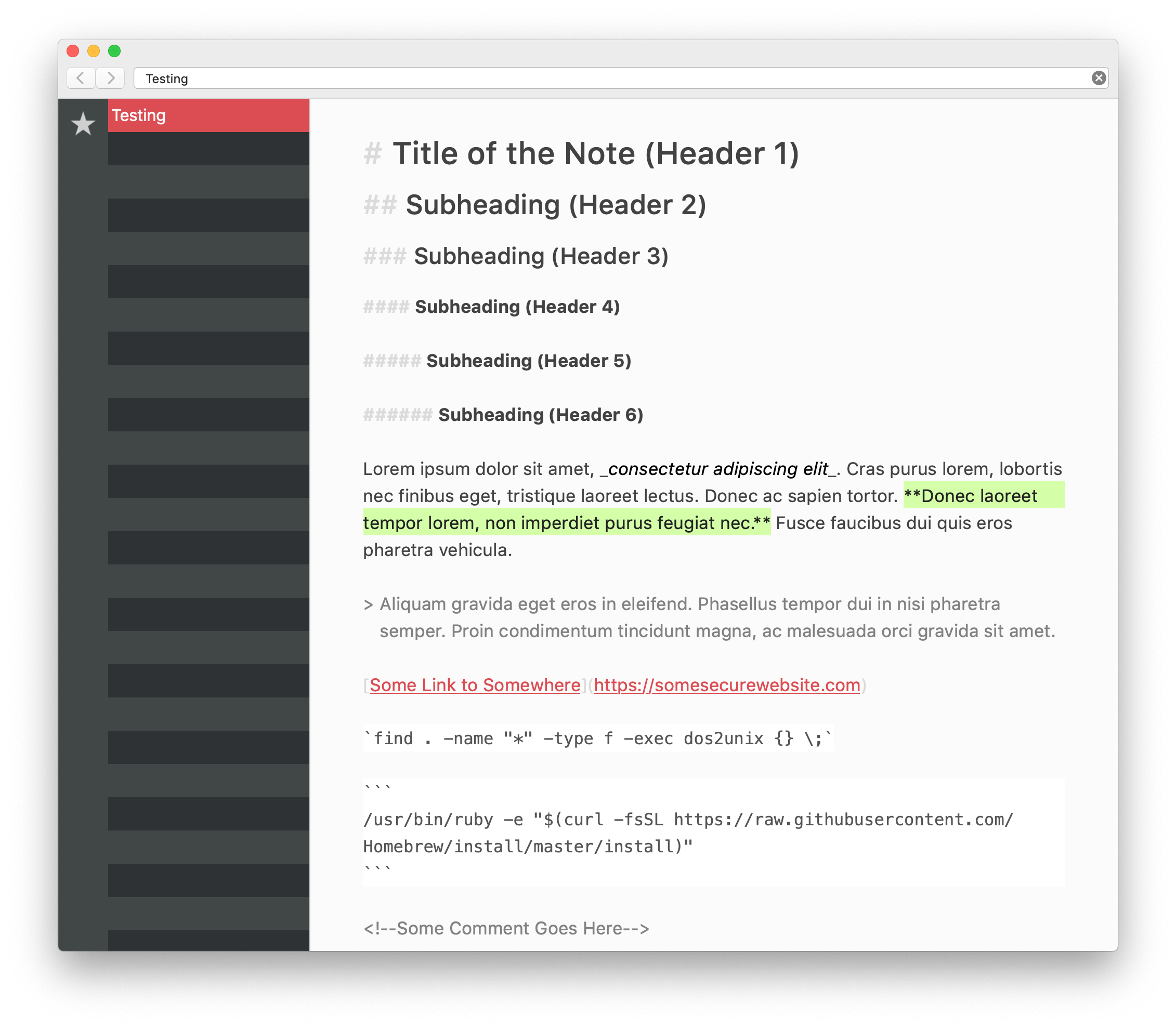
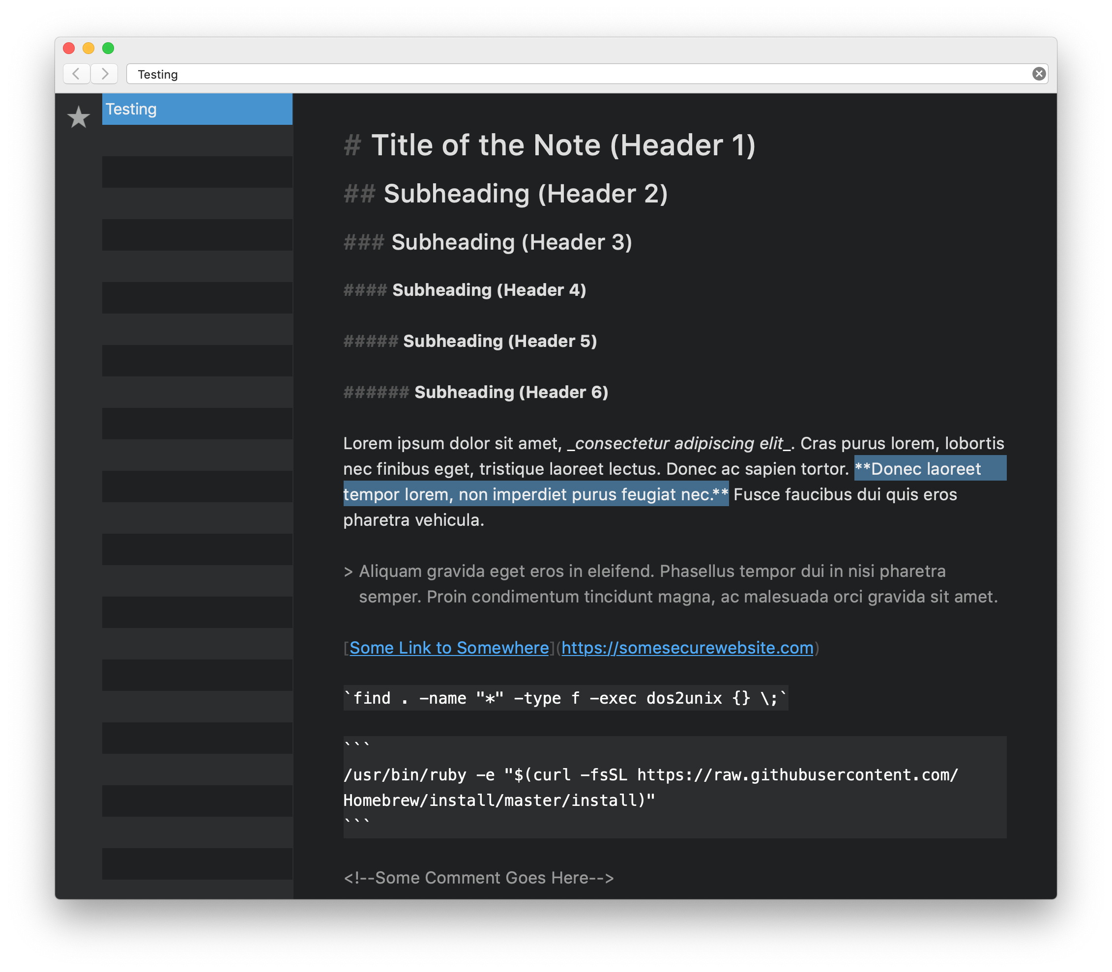
[Theme] Bear "Default" and "Dark Graphite"
I was using the Bear app for a while before I discovered The Archive app. It was obvious to me that I had to switch, but I missed the unique themes of the Bear app. I've attached respectable versions of the "Default" and "Dark Graphite" Bear app themes, named "RaspBeary (Light)" and "BlueBeary (Dark)," along with screen shots. Note that I have chosen to use bold text as a "highlighter" option. Enjoy!


Howdy, Stranger!
Comments
Thanks, Ken for the themes. I'm attracted to the brighter colors and styles in RaspBeary. Bold text as "highlighter" is interesting as I bold text to grab attention and highlighting the text sure focuses attention.
Will Simpson
My peak cognition is behind me. One day soon, I will read my last book, write my last note, eat my last meal, and kiss my sweetie for the last time.
My Internet Home — My Now Page
Thank you. Both of these are pretty good.
macosxguru