[REQUEST] Colored Timestamp ID's for Readability
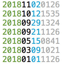
As I was looking through a bunch of notes, I found myself wishing that the ID TimeStamp text color could be modified so they could be easier to read. Here is the bad example:

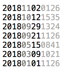
Or even something simple and monochromatic like this:

The general pattern to code could be:
- YYYY - darker
- MM - lighter
- DD - darker
- HHMM - lightest
How difficult to do would something like this be?
Post edited by ctietze on
Howdy, Stranger!

Comments
I like this idea! It's a good User Interface concept, if nothing else.