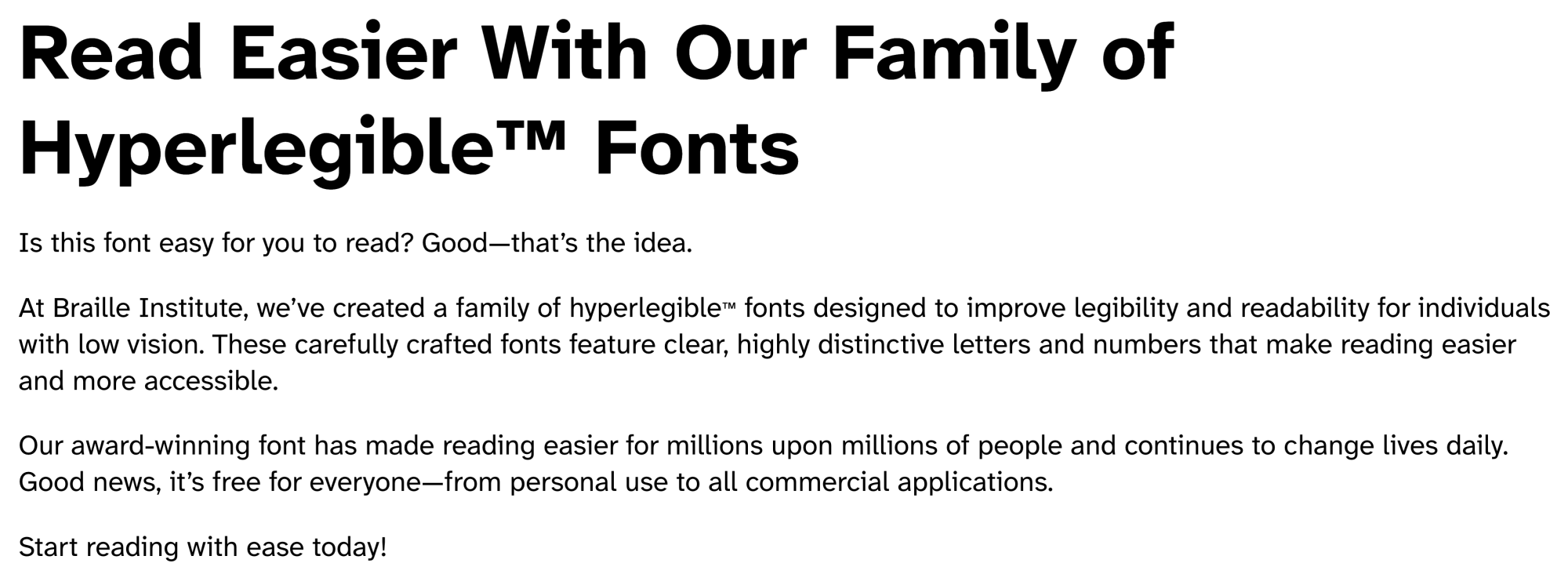
Atkinson Hyperlegible Font: New Version Just Dropped!

https://www.brailleinstitute.org/freefont/
This font served my late grandmother really well and I personally also like to look at it, I admit. The new version has more weights (bold was a bit thick for Retina displays, some argue); and there's now a monospace variant, too!
The monospace font is a bit "wide" compared to what I'm used to.
But you may want to give this a try if you believe you could benefit from font shapes that are designed to not be confusing.
Author at Zettelkasten.de • https://christiantietze.de/
Howdy, Stranger!
Categories
- 3K All Categories
- 152 Research & Reading
- 692 The Zettelkasten Method
- 7 Knowledge Work
- 99 Writing
- 464 Software & Gadgets
- 154 Workflows
- 729 The Archive
- 15 Plug-In Showcase
- 88 Resolved Issues
- 225 Projects Logs and Journals
- 83 Project: Zettelkasten.de
- 53 Critique my Zettel
- 171 Random
- 373 Introduce Yourselves!
Comments
@ctietze Thanks for the update! Atkinson Hyperlegible is my favourite and most used font. I didn't know they'd updated it.
I've been using Lexend Font., which is designed for individuals with reading difficulties. It is problematic because it lacks a monospace variant. However, it is pretty similar to Atkinson Hyperlegible, and it's nice to find an alternative.
Will Simpson
My peak cognition is behind me. One day soon, I will read my last book, write my last note, eat my last meal, and kiss my sweetie for the last time.
My Internet Home — My Now Page