Writing with transparent backgrounds in Emacs (KM macro for changing image & theme)

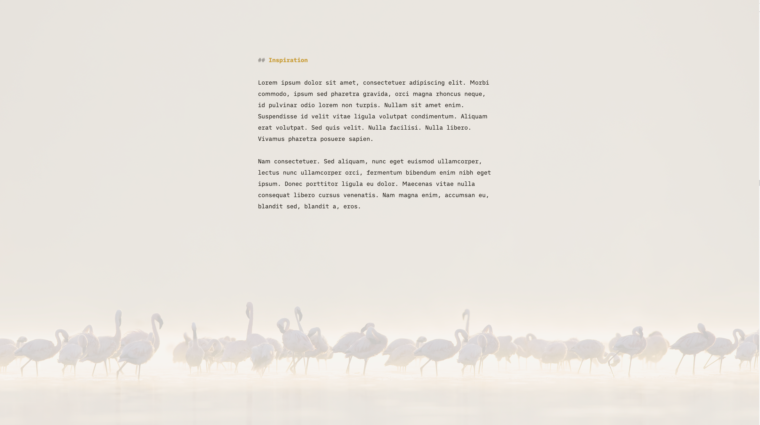
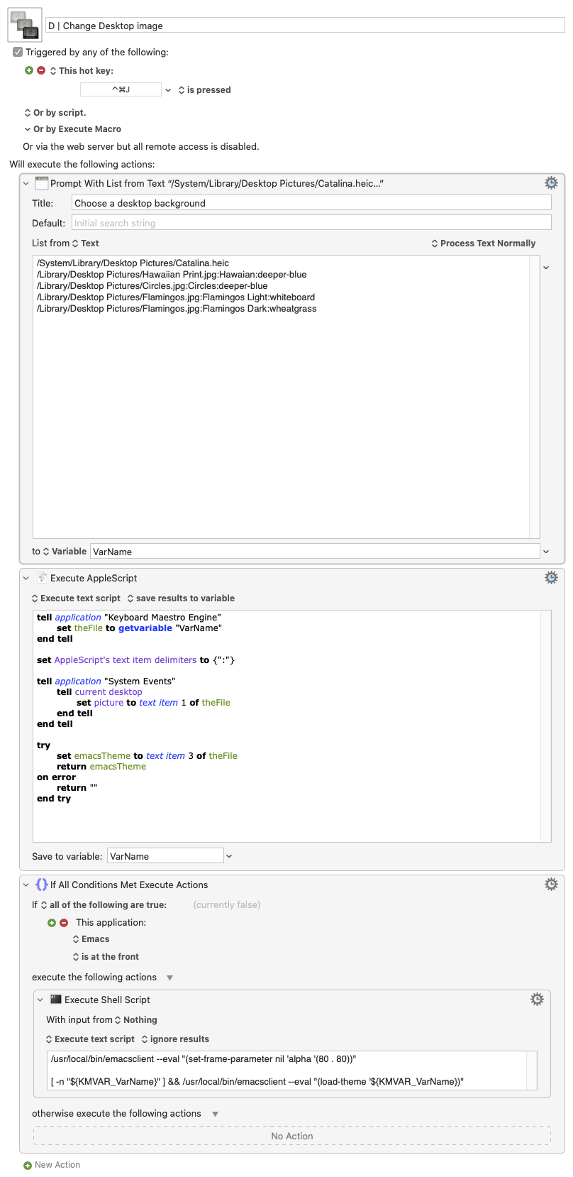
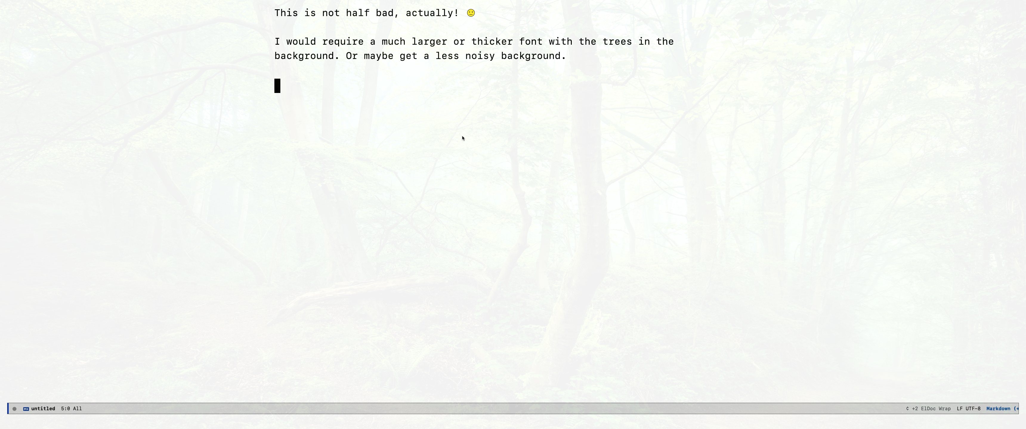
For those using emacs, this will mimic an interesting Scrivener feature. The Keyboard Maestro macro will change the desktop image from a list and, if Emacs is running at the front, it will (optionally) also set a corresponding theme at your choice.
You can configure the list using the following format:
Full path:Some description:spacemacs-theme
The image above displays text in olivetti-mode, using the great iA Writer Duospace font.
And this is the macro (I bind it to ^⌘J D):

If you need to Hide/Show Desktop Icons, you may use this script:
try
    set CurSet to do shell script "defaults read com.apple.finder CreateDesktop"
    on error
    set CurSet to "1"
 end try
 if CurSet is "1" then
    set NewSet to false
else
    set NewSet to true
end if
do shell script "defaults write com.apple.finder CreateDesktop -bool " & NewSet
tell application "Finder"
    quit
    try
        activate
    end try
end tell
Post edited by brunoc on
Howdy, Stranger!

Comments
iA Writer Duospace in Emacs with a writeroom-like mode. You madman
The result looks sweet, though.
So each line is a triple of values? Desktop wallpaper, something in the middle, and an emacs theme name?
Why did you opt for a transparent background? I wanted to say "it's too distracting", but when you hide everything else, it actually can't!

The modeline stands out a bit. Maybe nano-emacs or elegant-emacs settings would help: https://github.com/rougier/elegant-emacs/
Even with writing apps, I never even tried backgrounds, to be honest. I see Emacs users esp. with riced desktops and tiling window managers to set this by default. For writing, I could maybe even get behind this. Hmm.
What about subtle concentric circles that gently draw attention to the vertical middle of the screen?
Can recommend trying
centered-cursor-modein additon toolivetti-modefor this.Author at Zettelkasten.de • https://christiantietze.de/
I truly love their modified IBM Plex font!
I've been working with spacemacs, because it's practical. Extremely heavy, though. Maybe I'll experiment with this "elegant-emacs" setup, thank you for the reference!
But, yes. When writing prose, I always deactivate the modeline. Another nice thing to tweak is line spacing. This is part of my configuration (with some other details designed to interact well with Markdown apps such as The Archive):
(add-hook 'markdown-mode-hook (lambda () (interactive) (olivetti-set-width 69) (hidden-mode-line-mode) (set-fringe-mode 0) (setq line-spacing 13) (olivetti-mode 1) (text-scale-increase 1) (setq buffer-file-coding-system 'utf-8-mac) (auto-revert-mode) (smartparens-mode -1) (scroll-bar-mode 0) (local-set-key [(meta super up)] 'move-text-up) (local-set-key [(meta super down)] 'move-text-down) (local-set-key [?\s-i] 'markdown-insert-italic) (local-set-key [?\s-b] 'markdown-insert-bold))) (add-hook 'markdown-mode-hook 'real-auto-save-mode)I'll give it a try! Let's see how inspiring it can be...
Can't use it. I'm seriously addicted to ^L 'ing. ☺️
What about... fishes?
This is the KM Macro file. The attachment is broken in the original post.
Very cool!
In case you're not aware, for further "Scrivener-ization", there's binder-mode - written by the same dev who wrote olivetti-mode and the mighty fountain-mode.
I really dig doom-emacs. Startup is around 1.3 secs for me. It's emacs-plus-28 with native-comp on an M1 macbook pro though, which brings it's own occassional weirdness.
Olivetti doesn't get along so well with doom, so distraction-free mode happens through uncommenting 'Zen' - aka writeroom-mode - in
packages.el. There's a few bits to configure a truly distraction-free writing experience - e.g. inhibitingevil-echo-statein the minibuffer - but nothing super-complicated. I'm not a programmer and I was able to figure it out.I'm going to mess around with implementing your idea in elisp in doom. Could be fun to hack around on, learn something new.
Like the flamingo image and the fishes....both are very nice to look at.
Please note I do not see a link for the macro file in your post.
Am I missing something or ?
Thanks,
Mark
The subtitle of the Zettelkasten Forum is "Discussion about writing and research productivity methods."
Are there possible uses of a transparent background for providing sufficiently unobtrusive things with an impact on productivity?
E.g. in the spirit of elements that lead to a better focus (concentric circles have been mentioned), or not-too-tacky motivational images or quotes, or evocative verbal stimuli, or recipes for writing workflows, or other thinking tools.
Whipped up an ugly demo of the circle idea
Radial gradient with flat color in the middle, then fading to black
Overlay with transparent Emacs:
The background of the program makes everything even darker. It's also not a very tasteful shadow effect -- black on color desaturates and that looks dirty quickly. So if you have a yellow background, a dark reddish background with transparency might look waaay better.
Anyway, next iteration:
Circle in the middle transparent emacs with black BG on top:
That is more or less where the line centers while typing. The idea is to guide the eye.
But then again one might also look into
focus-modeto replicate iA Writer's sentence highlight:Oops transparency over the wrong window --- that's why I don't really like it for my main editor ---
Author at Zettelkasten.de • https://christiantietze.de/
These are super interesting ideas to explore!
Background: Per principles of visual construction as regards the hierarchy of drawing the eye, brightness is second only to movement. To state the obvious, a superbright fast moving object outshines all—forgive the pun.
Tangent One: Hence why so much assaultive social media design gives me a mild panic attack. My lizard brain can't discern the difference between a screen with a dozen bright flashing moving objects and a pride of lions approaching from the edge of my peripheral vision as dusk falls on the savannah.
Tangent Two: an excellent resource on learning the visual grammar and how to affect/manipulate perception is The Visual Story.
Implementation: It's a bit beyond my emacs-fu to quickly mock up something that plays well with doom-emacs and the theme hacks I have going on under the hood. That said, I can for sure envision the benefit of a linear gradient localizing brightness in the middle of the screen combined with
centered-cursor-mode. A subtler actualization of iA Writer-esquefocus mode. Which I always found distracting for whatever reason.Anyway. Super cool ideas.
@kohled said:
Thank you so much for the reference to binder-mode, which I didn't know! It gave me a big opportunity for stealing some code inspiration for implementing my own version of the sidebar!
I don't want to work with projects separated into different directories. I'd rather use structured notes that organize individual projects. The idea is to have everything integrated in a single system. This is how I've been working on my current project (a transformation of my dissertation into a book version).
As I keep a reference to "parent notes", a practical solution was to bind C-c ; to a function that will open the parent note in the sidebar. In this case, my note # 2119 contains the structured note for the book project After some other tweaks, such as making the wikilinks clickable, this is the result:
I think it feels more like Ulysses than Scrivener. Or something in between Scrivener's binder and Ulysses sheets. But very flexible, since it's Markdown you can fold, unfold etc.
I'm publishing the work in progress on GitHub. I'm calling it a
phi-modebecause "phi" is how I named my personal flavour of the Zettelkasten system years ago.Thanks for sharing the sidebar code, @brunoc! Your
§[[...]]links look good, to; much better than my[[zettel:...]]org-mode link prefixesWill play with that mode on Sunday. Your GIF looks very nice. Can't wait.
I know I am kind of tooting my own horn when I say this again and again -- but just look how cool it is to combine a checklist in a table of contents sidebar using plain text! It's great!
Author at Zettelkasten.de • https://christiantietze.de/
Please observe that phi-mode will expect to find the information about the parent note to be opened in the sidebar in a line beginning with a triangle (the symbol can be customized):
I've also implemented the possibility that a "master note" be opened in the sidebar by default when the current note has no parent (note id "0000" and that can also be customized).
I'm using this with a script I've called zettel-compose.py. It combines notes referenced from an index note, and, depending on parameters, other linked notes it may find in the way when reading children notes. The
§[[...]]syntax means that the linked reference contents should necessarily be added to the combined output. It is by the way a pretty cool script that will also watch the archive directory for changes, integrates with Marked etc. But the code needs some cleaning and the functioning is perhaps too idiosyncratic.Yes! This is super-practical and pleasant to work with. Makes one want to live inside emacs.