Why do you not use monospace fonts?

Folks,
judging by some screenshots and scattered comments throughout the past months, I noticed that some of you do want to use a non-monospace font for the editor.
Why?
We're concerned about how to make useful visual UI design decisions. Character-based width calculation hardly makes sense when you use a sans serif font. Could allowing Zapfino or Comic Sans as the editor font backfire in some way, make features unusable, or anything? Screenshots of the app will look pretty ugly for sure ![]() There are questions concerning user customization options that we cannot come up with, yet, and we worry if giving too much choice in the beginning limits later changes somehow. So here goes the informal user survey.
There are questions concerning user customization options that we cannot come up with, yet, and we worry if giving too much choice in the beginning limits later changes somehow. So here goes the informal user survey.
Author at Zettelkasten.de • https://christiantietze.de/
Howdy, Stranger!
Comments
Let me preface this by saying that I spend a ton of time with fixed-width fonts (FWF), and my notes in nvALT are rendered in Monaco, my long-time favorite monospaced font.
That said, I still find variable-width fonts (VWF) easier to read for general purpose texts, and I really like that text is more compact, so you can fit more information in one line and on one page. I have a very visual approach to my notes: Whenever I try to remember some information from a note, I always have a picture of the layout of the note in my mind. Having the information less spread out is really helpful in this regard.
Because of these advantages, I've tried a few times to switch to a VWF in nvALT, but since I sometimes have code or other information that needs some "layouting" in my notes, and it's either VWF all the way or not at all, these attempts have not lasted for very long.
When I read your announcement that the new theme standard will support different fonts for different element types, I got really excited. By using a FWF for codeblocks and a VWF for everything else, it would be possible to have the best of both worlds. Bear already does this and it is pretty cool.
Considering that almost all "regular" text on the web, in books, etc. is in VWFs, there seems to be widespread agreement that VWFs are easier to read. So you might have to reverse that question: "Why would you not use VWFs? (assuming you could still use FWFs for certain parts that benefit from them)"")
If you like The Archive's "PrettyFunctional (Basic)" theme, consider upgrading to the "PrettyFunctional (Regular)" theme.
Ha!") But not quite!
But not quite!
I am into typographic details and totally agree that font families with variable-width are superior for reading. The thing is: your note archive app is not a reader, but a writer and editor. That's another use case and poses different challenges.
Author at Zettelkasten.de • https://christiantietze.de/
Respectfully disagree. Reading and processing the information are a necessary part of the workflow of using the Zettel as an external brain. One could argue that the user won't be reading "long" texts in the Archive, but what's the line of "long"? At what point does one arbitrarily decide that "this bit of information is large enough that everyone needs a VWF"?
VWF is one of the few reasons I do almost no writing in vim")
Fair point. I cannot think of any reason to explicitly forbid non-monospaced fonts.") When the new themes are shipping, please share a picture of your customizations (or even the theme file), so we can evaluate if something like that should be part of the default set of themes!
When the new themes are shipping, please share a picture of your customizations (or even the theme file), so we can evaluate if something like that should be part of the default set of themes!
Author at Zettelkasten.de • https://christiantietze.de/
I am preparing a blogpost on monospace fonts and the benefits of them. But I think I should share a short version upfront because I don't know when we will publish it (some work should be done before hand):
Allows for clear design of structure notes
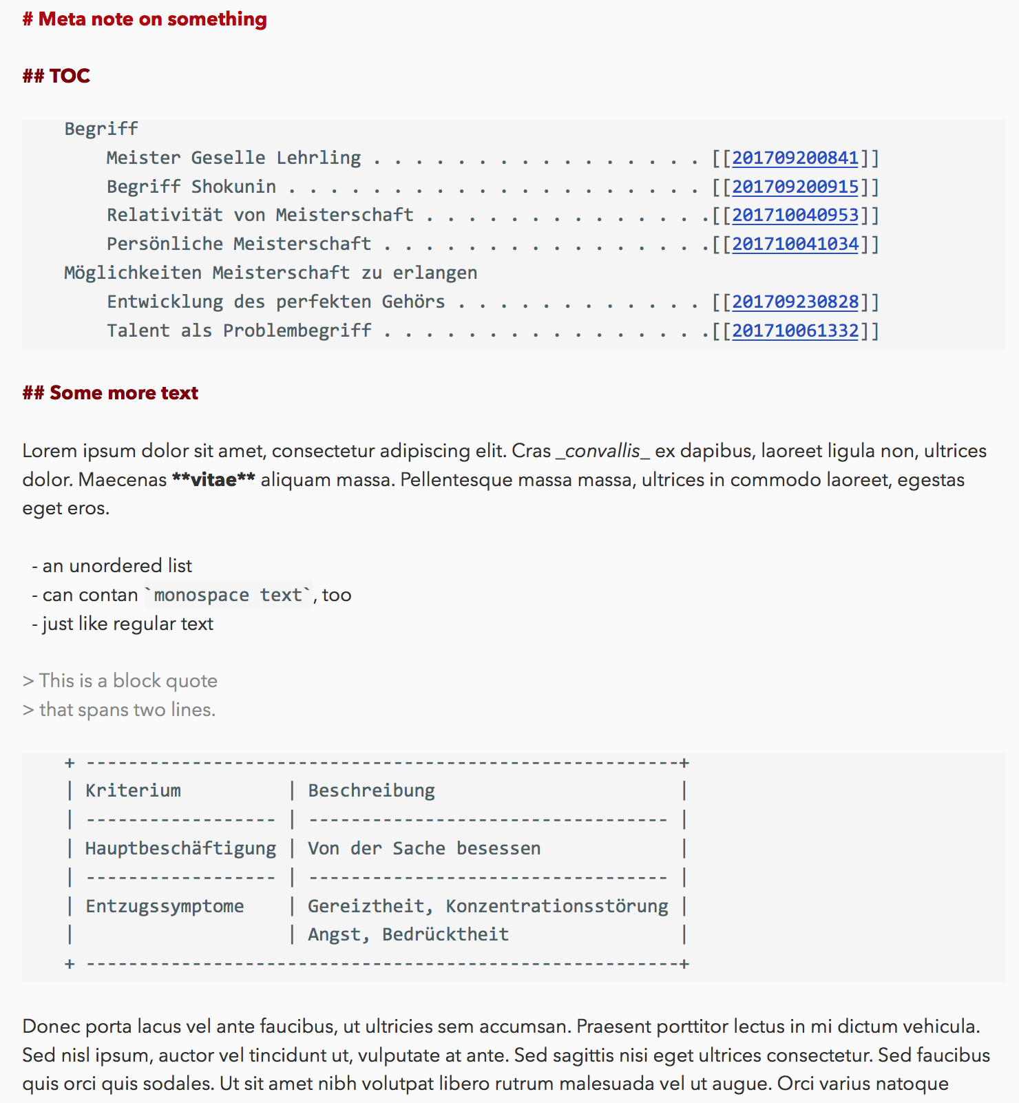
Monospace allows for a very clear design for structure notes. This is due the predictability of the length of one character. See the image (It is a structure note on mastery)
Readable tables
Another reason is the use of readable tables.
Makes ASCII-Art possible
A third reason is the possibility of ASCII-Art (which I only use in my Emacs)
Makes more independent from software
You could ask: Why doesn't the software handle this? My answer is: It shouldn't because it makes you dependent on software and you don't want that. #softwareagnosticprogramming
I am a Zettler
Our current plans are:
Any thoughts on that?
I am a Zettler
As I wrote above, whenever my notes had to be either all-fixed-width or all-variable-width, I have generally picked the former in the past. Having parts of notes shown in a variable-width font that do really need "layouting" is pretty bad and not worth the overall increase in readability and compactness you get from variable-width fonts.
To me, it seems the perfect solution would be to use a fixed-width font only for the parts that really need it (like the examples @Sascha has given), and to use a variable width font for everything else.
It looks like you can already achieve this with The Archive by assigning a monospaced font to codeBlock elements inside the theme file and setting the main notes font to a variable-width font. I would love to actually give this a try, but so far, I have been unable to to guess the correct syntax for assigning a font inside the theme files. Maybe @ctietze can shed some light on this?
If you like The Archive's "PrettyFunctional (Basic)" theme, consider upgrading to the "PrettyFunctional (Regular)" theme.
Inside the block styles, put a
fontsetting like this (dramatic effect intended):"codeBlock": { "font": { "name": "Menlo-Bold", "size": 60 }, "color": "#586e75", "backgroundColor": "#eee8d5" }Author at Zettelkasten.de • https://christiantietze.de/
Thanks, @ctietze!
Turns out, I did guess the "name" part correctly, but it didn't occur to me that I would also need to specify a size for the font to be actually used.
Anyway, I am very happy so far with my hybrid variable/fixed font theme. I think I will stick with it and reformat my notes accordingly.
If you like The Archive's "PrettyFunctional (Basic)" theme, consider upgrading to the "PrettyFunctional (Regular)" theme.
@ctietze not to push this too far, but is there a way to specify
"seize" :in a way that would be relative to what is set in preferences ?@Basil can you give us a screenshot of a note with various elements that mix fixed/variabel fonts?
I am a Zettler
@Sascha, here you go. I OCR'ed your table of contents and added a bit of demo junk text:

It's not particularly pretty, but it gives you a general idea of how mixing variable-width and fixed-width fonts can look.
If you like The Archive's "PrettyFunctional (Basic)" theme, consider upgrading to the "PrettyFunctional (Regular)" theme.
Can you share your theme file? I want this thing.
Sure thing, @mediapathic, I have attached the theme to this post.
I'm still experimenting a bit with which fonts to use. In the theme file, I've put Consolas as the fixed-width font for codeBlock and inlineCode. If you want to use a different font (or if you don't have it on your Mac and don't want to download it), you can just change the two instances of Consolas in the theme file to the name of the font you want to use (using any text editor, such as BBEdit).
When I took the screenshot above, I had set Avenir Next as
The Archive Preferences -> Editing -> Font. After a bit more soul searching, I think I might actually go with San Francisco (which is called SF Pro Text, when downloaded from here). It's the font I've used in 1Writer on my iPhone for a long time, and I like its bold version better than that of Avenir Next.This is the San Francisco version of the demo note from above, which I've cleaned up a bit and added part of @Sascha's table to:
If you like The Archive's "PrettyFunctional (Basic)" theme, consider upgrading to the "PrettyFunctional (Regular)" theme.
@basil this is great. Now my font looks pretty, and my tables make visual sense. Thanks very much.
Thanks @Basil
Looks awesome. (So awesome I want to try mixing fonts in the near future)
I am a Zettler
One day I might finish MultiMarkdown table support so you don't have to indent it as code anymore.")
I took note that making the
sizeproperty mandatory is confusing. Will have a look at+xand-xsize specifications so you can insert relative font sizes.Please note that "San Francisco" is the macOS system font since Sierra (but which Apple does not expose to users; seems they want to keep it "secret" and used only for interface elements; it comes with a ton of different weights). If you folks really dig that theme, I'll consider adding an option to use the macOS system font in addition to named fonts.
(Btw, never be too shy sharing awesome themes I should shamelessly rip off ship with The Archive in the dedicated discussion.)
Author at Zettelkasten.de • https://christiantietze.de/
Thanks for clearing that up. I was a bit surprised, when I did not see San Francisco in Font Book.app on my Mac that is running Sierra, because I remembered that Apple introduced the font with El Capitan, and it seemed a bit weird that they would apparently remove it just a year later. I didn't give it much further thought, though, and just did a quick Alfred search for "download san francisco".
If it's relatively easy for you to make San Francisco available within The Archive, I think that would be a nice touch. The font both looks great and is very easy to read, which is not a very common combination.
I do like the idea to allow +x/-x for the size parameter in theme files. What complicates things slightly, though, is that font sizes sometimes differ significantly at the same point value. For instance, Monaco 12 is significantly bigger than Consolas 12, and actually even slightly bigger than Consolas 13. On the other hand, people who are really picky about things like this, might also be the type of people who edit the theme files by hand anyway.
You are more than welcome to shamelessly rip off pay homage to my PrettyFunctional theme. I've tweaked it a bit more since I posted it, and I'll do another round of revisions soon, especially regarding which monospaced font to use, since a bundled theme should not use a font such as Consolas that does not come with macOS. Once I'm done, I'll post the updated version to the Share your Theme thread.
If you like The Archive's "PrettyFunctional (Basic)" theme, consider upgrading to the "PrettyFunctional (Regular)" theme.
Just noticed that, inside code blocks, links are not supposed to be functional. Verbatim blocks are used to show how something is in its raw form, so neither
[[...]]nor#hashtagshould work.Author at Zettelkasten.de • https://christiantietze.de/
Hmm... *deep sigh*... you are not wrong.
In theory, we could also use blockquote for the monospaced parts. There, the links are supposed to work, and they already do in TA. But it would then be a bit awkward to use block quotes for both actual quotes and things like @Sascha's link lists. Requiring actual quotes to be monospaced would also not be ideal.
Plus, in most markdown environments, code blocks are rendered in monospace and everything else (including block quotes) are rendered in variable-width, so sticking with code blocks would be a much, much better fit.
The main purpose of code blocks (in addition to applying a monospaced font) is to prevent stuff from being translated (e.g.,
\tinto a tab, the raw code of a link into an actual link, etc.). Since TA does none of these translations and just underlines/highlights the links and tags, this does not strike me as a serious violation of how code blocks are supposed to work (although it definitely is a violation).I don't think there is an ideal solution, but if I had to make the decision, I would keep TA's current behavior regarding code blocks and maybe consider adding an Ignore links and tags in code parts option to the preferences. I am not sure, though, how many people would actually use that option.
If you like The Archive's "PrettyFunctional (Basic)" theme, consider upgrading to the "PrettyFunctional (Regular)" theme.
Just found the iA Writer Duospace font yesterday. It essentially is a monospace font with some characters at 150% width ("m" and "w", most notably), keeping most characters tight but not squeezing wide characters as hard.
See the accompanying blog post in typical iA style:
https://ia.net/topics/in-search-of-the-perfect-writing-font/
Author at Zettelkasten.de • https://christiantietze.de/
I initially found the duospace idea very intriguing, but upon closer inspection, it seems to me that it is combining the disadvantages rather than the advantages of fixed-width and variable-width fonts: Readability is not much better than for actual fixed-width fonts, and you can no longer reliably layout tables and such, because things break down whenever you have an uneven number of 'w' and 'm' characters in a particular line.
What is a bit hilarious (and also mildly insulting), is that I get a "Bad Taste Ahead" warning in The Archive, when I switch from the relatively ugly iA Writer Duospace back to my stunningly beautiful and incredibly easy to read SF Pro.")
In all seriousness, though, I'm still incredibly happy with my theme that combines a fixed-width font for code blocks with a variable-width font for everything else. I know, to you, that was just a collateral effect from revising the theme system, but to me, it is one of the killer features of The Archive. Thank you so much again for making that possible!
If you like The Archive's "PrettyFunctional (Basic)" theme, consider upgrading to the "PrettyFunctional (Regular)" theme.
If it makes you happy, I should be happy, too") Looking forward to have a theme repository, possibly with statistics one day, and then watch as all the poor users flock to your mixed font theme instead of sticking to the One True Monospace.
Looking forward to have a theme repository, possibly with statistics one day, and then watch as all the poor users flock to your mixed font theme instead of sticking to the One True Monospace.
Author at Zettelkasten.de • https://christiantietze.de/
Ah, the duospace. I am getting used to it because I am likely to switch from Ulysses to iA-Writer.
@Basil It would be a very interesting experiment to test text comprehension, readability etc.
I think besides personal taste it is the only way to say something with some authority on this topic. I've read some blogpost from the Information Architects but it seemed rather without any empirical evidence.
They argue that the monospace font slows you down for a good reason. This is better for writing and editing because you break some pattern recognition effeciency.
I am a Zettler