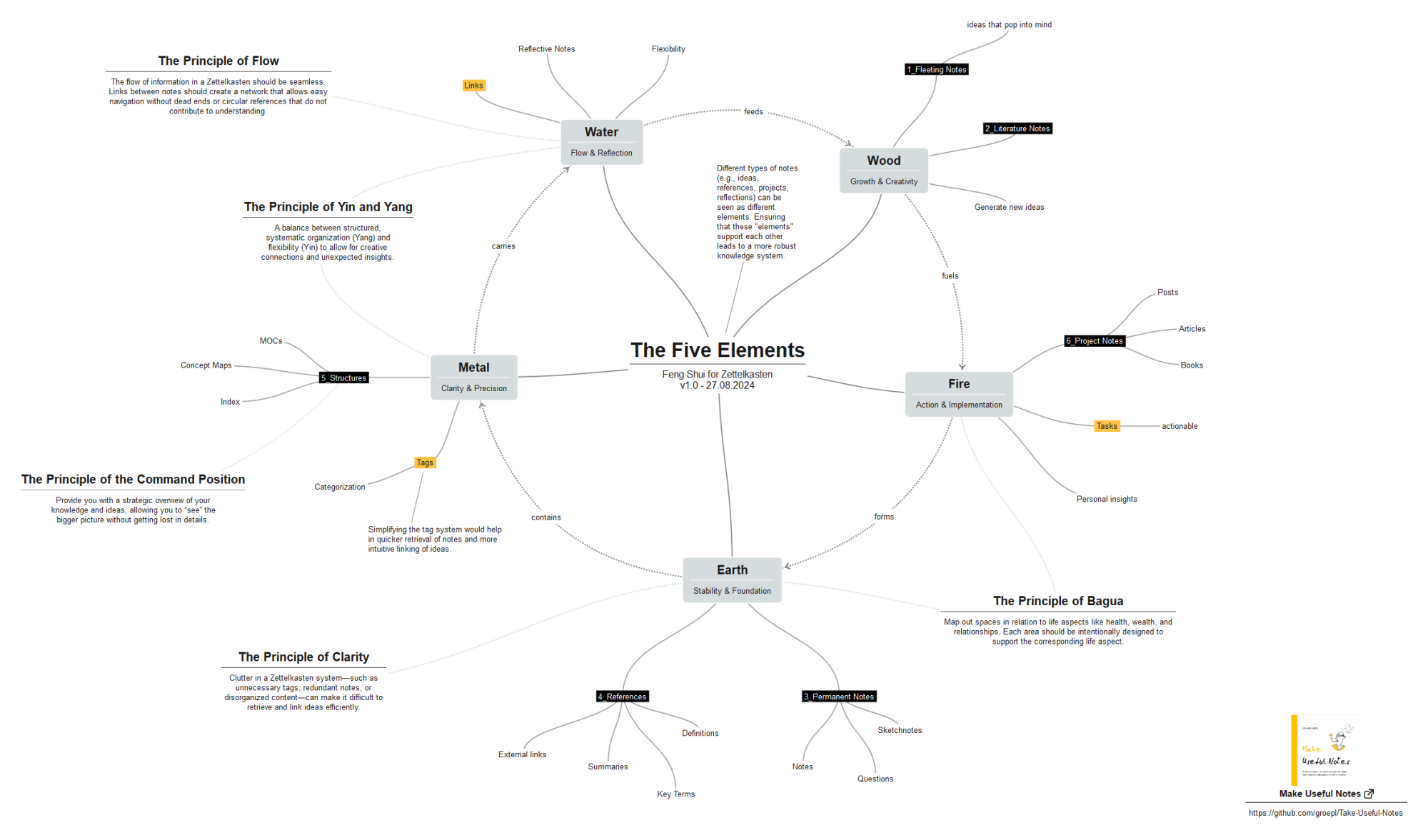
The Five Elements - Feng Shui for Zettelkasten

My Zettelkasten has been around for about 2.5 years now. After about six months, I had the idea of tidying up the Zettelkasten for the first time. Somehow it bothered me that parts of the box looked very tidy, while others looked quite chaotic.
Initially, my activities to improve this situation were still very sporadic and unsystematic. I lacked a ‘method for tidying up’. But it wasn't so easy to find. Even my favourite source ‘How to take smart notes’ by Sönke Ahrens didn't help me.
Why don't I use Marie Kondo's method? She already helps me tidy up my socks. Why can't she also improve the situation in my Zettelkasten ? Thought, done: Since 14 May 2023 (create date, Zettelkasten), I have been tidying up using the method.
But I can do even better. Today, while I was tidying up my Zettelkasten, I was offered the note ‘Simplicity’. And Google was kind enough to point me to ‘The Five Elements’ within Feng Shui via ‘The Principle of Clarity’.
And yes, Feng Shui has been identified by scientists and philosophers as both non-scientific and pseudoscientific, and has been described as a paradigmatic example of pseudoscience. But it has helped me to find a different way of looking at my Zettelkasten. Looking at WOOD, FIRE, EARTH, METAL and WATER makes new connections that were invisible without this framework.
I also added "The Five Principles" which helped me to find the right balance to tidy up my Zettelkasten.
What experiences have you had? What is the best way to tidy up a Zettelkasten?
Edmund Gröpl — 100% organic thinking. Less than 5% AI-generated ideas.
Howdy, Stranger!

Comments
Nice! The diagram reminds me of the flower petal diagram or template that @Sascha used in "How To Use Creative Techniques Within the Zettelkasten Framework" (especially because Sascha's flower also has five petals). The five feng shui elements are another option for the petals in a flower petal diagram.
@Edmund Thanks for sharing the diagram and metaphor! What I like most about Zettelkasten structure and process metaphors is that they remind me of things I may neglect. A checklist could do the same, I guess, but this looks much nicer and inspirational
Author at Zettelkasten.de • https://christiantietze.de/
My ideas:
Why do we prefer text-based tools for working with networks?
Edmund Gröpl — 100% organic thinking. Less than 5% AI-generated ideas.
@Edmund said:
I wouldn't say I prefer text-based tools, but there are so many text-based software tools available, and Unix philosophy–based text processing techniques and traditions,1 that it makes sense for me to make my work compatible with such tools when possible.
The emotionality may depend on the content. The curved lines in your diagram above feel "softer" than straight lines would be (this is also true of Sascha's flower petal diagram), but if you had used straight lines, then the feeling of the diagram would not have been much different from a table or list, I think.
John W. Maxwell (2020). "Text processing techniques and traditions". In: Crompton, C., Lane, R. J., & Siemens, R. G. (eds.), Doing more digital humanities: open approaches to creation, growth, and development (pp. 70–83). London; New York: Routledge. See this previous discussion for a relevant quotation. ↩︎
Yes, some parts of a diagram are "invisible". More about "the feeling of the diagram": https://debasreedeyart.com/emotions-of-lines-in-art/
Edmund Gröpl — 100% organic thinking. Less than 5% AI-generated ideas.
@Edmund said:
Yes, line qualities are part of visual art fundamentals, also covered in many classic textbooks.